
Chapters in this Series:
1 | 2 | 3 | 4 | 5 | 6 | 7 | 8 | 9 | 10
This article focuses on how combining SAP® and GIS data helps planners see the spatial and topological relationships between assets, work, and the environment. It also shows how planners can consume the combined data using dashboards, web maps, and other visualization tools.
From planning and design, mobile data collection, asset and work integration, maintenance mobility and impacts on environmental, health and safety – using GIS and SAP together ensures companies:
- Maximize asset usage
- Increase plant safety
- Increase plant efficiency
- Maintain compliance
Better Data Means Better Decisions
Throughout the asset lifecycle we collect and store huge amounts of data about our assets:
- Location
- Characteristics
- Maintenance history
However, this data is typically stored in multiple systems.
To make quick, accurate, and proactive decisions on a day-to-day basis the data needs to be consolidated, integrated, and distributed using an automated process.
For example, integrated SAP and GIS data can show environmental factors causing specific equipment to need more maintenance. Knowing this, planners can avoid downtime by proactively increasing planned maintenance in other locations with similar environments and equipment.
Disconnected systems only show partial views of factors that influence asset health. By integrating SAP and GIS, organizations can use spatial and tabular analysis to get a complete view of their critical assets throughout the asset lifecycle.
Mercury from Rizing
We believe so strongly in the benefits of automatically synchronized SAP and GIS data that we built a tool to do it.
Rizing’s Mercury eliminates the need for manual data updates in both SAP and GIS. It automates the synchronization process, combining spatial and technical asset data into one logical entity. Your teams are more efficient and productive while continuing to work in the system best suited to their role.
Analytics: Choose Wisely
Analytics should:
- Create new insights
- Be shareable
- Be in an easy-to-consume format
- Be consistent
- Be repeatable
- Track changes
- Show trends
- Create actionable items/work
Selecting the right approach and analysis tool depends on:
- The type of data we’re working with.
- How dynamic or static the report interface should be.
- How to best communicate the results – graphs, charts, maps, tabular data, etc.
- A well-rounded analysis will probably have a combination of all these components.
The Circle of Life
You might find the result of your analysis leads you back to the beginning of the asset lifecycle process, giving you more data to analyze in the future.
For example, an analysis using integrated GIS and SAP data may show locations where certain types of assets are missing or deficient. This will prompt the lifecycle to re-start with plans to create or improve those assets.
SAP Strengths
As the system of record for work-related activities, SAP houses data for:
- Work management
- Work history
- Materials management
- Characteristics of non-spatial features and equipment
Analysis on the asset and work data in SAP alone can be a very powerful tool. However, an Enterprise GIS will provide spatial context that SAP lacks.
GIS Strengths
An enterprise GIS focuses on the attributes and characteristics of assets and geographic features.
Better Together
A wholistic analysis combines spatial and non-spatial data by integrating SAP and GIS to consolidate critical data elements for analysis.
These reports can be interactive or static and be visual or tabular. There are different tools planners can use to generate them. Let’s look at some industry-specific examples:
Roads & Highways
Data stored in GIS typically includes the spatial representation of the roadway network plus characteristics such as:
- Speed limit
- Number of lanes
- Pavement condition
- And assets including:
- Signs
- Guardrails
- Medians
This data is commonly stored in a linear referencing system (LRS).
In SAP, the same roads may be represented as functional locations, but instead of storing the network geometry SAP tracks the hierarchical asset and technical object structure along with work history.
Integrating SAP and GIS data allows planners to find answers for questions like:
- Where are the deficient pavement sections where no improvements have been completed in the past 10 years?
- Where are all the guardrails with materials from a certain supplier that were installed in the past 5 years?
Visualization Methods for Analysis
Now that we’ve consolidated our data and determined the analysis method, we need to visualize the results in a way that lets decision makers efficiently add more data points to their decision-making process.
An effective way for decision makers to consume spatial and tabular data through a single user interface is an Esri Operations Dashboard. It’s an easy-to-set-up and robust web interface for interacting with asset data in GIS and SAP.
For example, planners can create a dashboard that plots all SAP work orders associated with assets on a map.
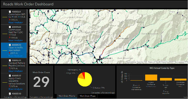
By selecting a specific work order, users can view work order attributes and updated metrics.
Work orders by priority are displayed using a pie chart. Work orders by cost type are summarized on a bar chart.
Data from multiple data sources can be combined, summarized, and visualized to answer questions like:
- As a maintenance manager, what does my backlog of work look like and what are the priorities of outstanding work orders?
- Where are my emergency/priority work orders located?
- Can I complete multiple work orders in the same area and reduce mobilization costs?
- As a capital planner, how much money was spent in a particular area on specific maintenance activities over the past 3 months?
Straight-line Diagrams
At Rizing we work with many organizations that model their asset data using a linear referencing system. Historically, a straight-line diagram has been a proven visualization and reporting tool that shows a static cross-section view of linear and point assets.
But the old dog can learn new tricks.
When we create a straight-line diagram as a dynamic web-based application displaying GIS and SAP data, with map integration, video log data, and other linear characteristics, the old tried-and-true straight-line diagram finds new life.
Other Rizing Tools
Rizing’s Road Analyzer, Rail Analyzer, and Pipe Analyzer are dynamic straight line diagram tools that integrate live GIS and SAP data to show trends and perform analyses.
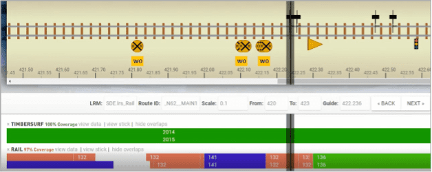
Rail Industry
When analyzing rail data in a straight line diagram, we visualize the the linear and point assets and characteristics along the track to better understand how they relate to another.
For assets sharing common identifiers (such as Functional Location ID) with data in SAP, creating a relationship from GIS data to SAP data (or view in the map service feeding the application) allows the straight line diagram to incorporate SAP data into its analysis.
In the example below, Work Orders from SAP are shown as yellow boxes below their associated rail crossings in GIS. This lets a user drill into SAP work history for a specific rail crossing in GIS.
Having SAP data in the straight line diagram helps explain why an asset has a certain condition or status without having to jump between applications.
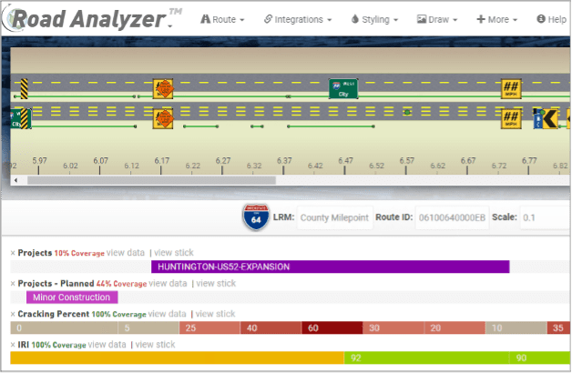
Road Industry
Pavement condition data is a key metric for transportation organizations deciding on future projects and spending. This data is typically stored in GIS, with Route and Measure references for pavement condition extents.
To analyze pavement condition data with historical and planned work, linear work order data from SAP can be published in tabular format. Route IDs and Measures then locate the data in the straight line diagram.
With SAP integration, we can plan annual work for a section of pavement by looking at:
- Active pothole data (SAP notifications)
- Previous repair data (past SAP work orders with costs)
- Latest pavement condition data
- Upcoming capital project work (SAP work orders and portfolio program items)
Additionally, Road Analyzer integrates with other applications and visualization tools to generate reports from multiple data sources and formats, all in a single interface.
For example, integrating with a videolog data tool (like Road Video Viewer) enables Road Analyzer to display real-world views of an area. This helps planners answer questions about asset condition, asset location, etc.
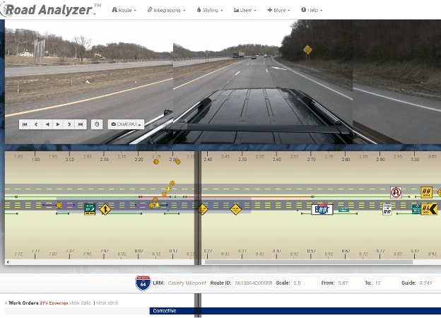
Tabular-focused analysis is often needed to satisfy key reporting needs.
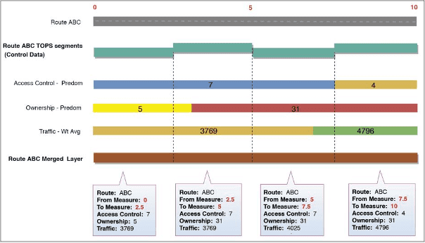
For example, dynamic segmentation is a critical analysis component for roadway reporting because it allows de-normalizing linearly referenced data stored in a normalized data model (like Esri’s Roads & Highways solution).
Rizing’s Segment Analyzer creates complex, repeatable processes to dynamically segment, aggregate, and post-process data from disparate sources to answer questions like:
- How many rail signals in poor condition exist in sections of track with maximum speed above 60 mph?
- How many miles of onshore 10-inch diameter Coated Steel Pipe do I have in my system that was installed between the years 2000 – 2009?
- What was the weighted average of traffic counts on a particular route in access-controlled areas during 2019?
- What is the most popular surface type on portions of routes with a roughness index above a certain threshold?
Segment Analyzer (along with HPMS Assistant and Validation Assistant) provide a seamless workflow for United States Departments of Transportation to satisfy annual reporting requirements on federally-mandated data items and logic rules.
Integrating GIS and SAP is the key for doing this type of analysis efficiently. Rizing’s Mercury eliminates duplicate data and streamlines the analysis and reporting process.
Summary
The tools discussed in this article work together to create a wholistic analysis and visualization ecosystem that combines spatial data from GIS with the financial reporting, performance management, predictive insights, and enterprise planning capabilities from SAP.
This gives asset-intensive organizations the ability to analyze data from various systems without duplicating it.
Organizations can visualize the data through a set of common dashboards easily accessed by key decision makers, forming a centralized backbone for analysis and reporting.